

Tailwind CSS Components
Use these Tailwind CSS components to quickly add UI elements like navbars, cards, forms, buttons, modals, and more to your project. They’re ready to use and help you build responsive websites faster.


Tailwind CSS Blocks
Use these Tailwind CSS blocks to put together pages quickly. Add prebuilt sections like hero banners, pricing tables, testimonials, login forms, and more, then customize them to match your project.


Tailwind CSS E-commerce Components
Use these Tailwind CSS components to create e-commerce websites quickly. Get ready-made sections for product listings, product pages, shopping carts, checkout flows, and everything else you need to launch your online store.


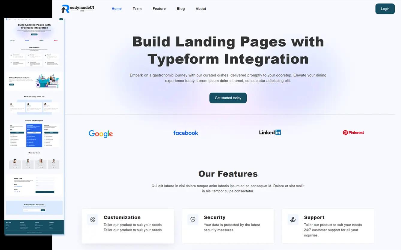
Landing Page Templates
Want a landing page fast? Grab these Tailwind CSS templates—they’re super clean, look great on any device, and perfect for getting your product, app, or service out there without the extra work.
Responsive Design
Make sure your website looks great no matter the screen size.
- Looks perfect everywhere: Whether it’s desktop, tablet, or mobile, your users get a smooth experience.
- Adjusts automatically: Your site adapts to any device without extra work.
- Consistent on all screens: Keep your website looking clean and professional everywhere it’s viewed.
What ReadymadeUI Users Say
ReadymadeUI users and members share their experiences with the components and templates they've used in their projects.
Marco Concas
Thank you for providing practical and working examples. The designs are not only functional but also beautifully elegant, enhancing the overall user experience.
Alisher
These templates are exactly what I needed for my rapid application development projects. Thank you for the great work and dedication!
Ben Briggs
The UI designs are top-notch and very well thought out. They saved me a lot of time in my development process. Excellent resource!
Robert
It is an excellent source of modern components ready for immediate use. It significantly reduced my design workload. Thank you!
Maguire
Amazing work. The MIT license makes it even better. I really appreciate the flexibility and quality of the templates.
Samantha Lee
The components are beautifully crafted and highly customizable. They perfectly matched my project's branding needs. Great job!
Pay once. Build forever
Upgrade once for lifetime access to premium templates, Next.js sites, and commercial license.
Pro Lifetime
One payment. Lifetime value.
$49 + local tax
- Everything in Free
- Landing Page Templates
- Weekly New Landing Pages
- Complete Next.js Starter Sites
- New Next.js Sites
- Commercial License
- Lifetime Access & Updates
Frequently Asked Questions
What is ReadymadeUI?
ReadymadeUI is a collection of ready-to-use Tailwind CSS components, blocks, and eCommerce templates that help developers and designers create modern websites more quickly.
Can I use the components and templates in commercial projects?
Yes, you can use all UI components, blocks, eCommerce blocks, and landing page templates in personal and commercial projects under the MIT license. However, redistribution or resale is not allowed.
Next.js site templates are provided under a commercial license and can be used in your own or client projects, but not for resale or redistribution.
Can I use the components and templates in multiple projects?
Yes, you can use the UI components, blocks, landing pages, and even Next.js site templates in multiple personal or client projects.
Do I get future updates?
Yes. All plans include ongoing updates with new components added weekly, new landing pages, and e-commerce templates. The Pro Lifetime plan also includes Next.js starter sites.
Are the components built with Tailwind CSS?
Absolutely. All UI components are built using Tailwind CSS, making them easy to customize and integrate into any Tailwind-based project.
What version of Tailwind CSS are you using?
We use the latest version of Tailwind CSS via CDN: (v4.0)
<script src="https://cdn.jsdelivr.net/npm/@tailwindcss/browser@4"></script>
Do you offer support?
Yes. All users get access to priority email support.
What is your refund policy?
We offer a 14-day refund window for all purchases, including lifetime plans and Next.js site templates. If you're not satisfied, you can request a refund within 14 days of purchase.
To request a refund, email us at support@readymadeui.com with your purchase details.